




We wanted creating a signature template to be simpler, and to happen without the rest of the app getting in the way. That's the intent behind this redesign: a more immersive editor, where everything you need sits in front of you.
Your template editor now opens full screen, in a completely rethought interface.
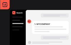
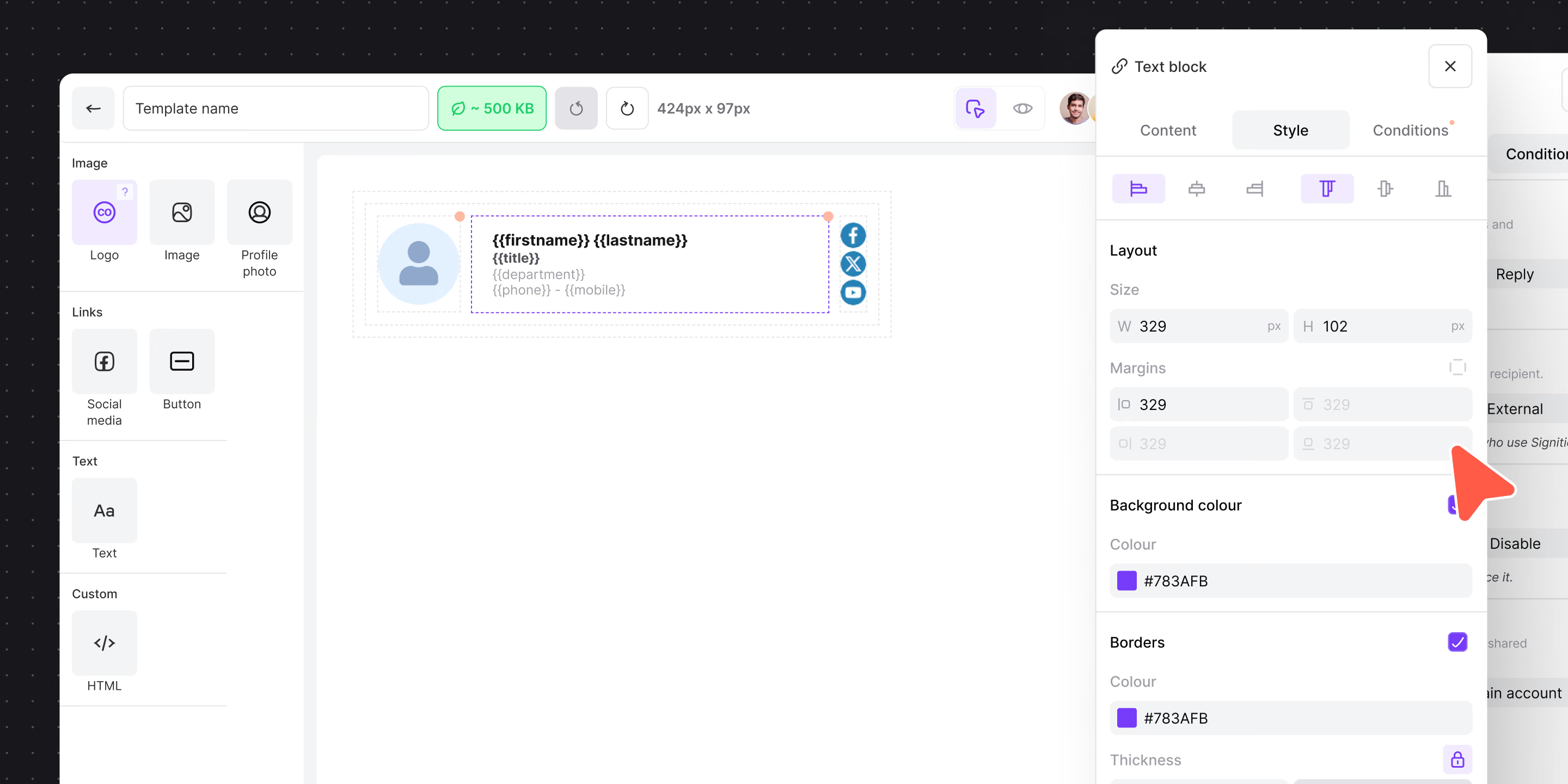
Three zones, one single view: the block library on the left, your signature in the centre, the settings for the selected block on the right. A top bar brings together the template name, undo, dimensions, HTML weight, preview, assignment and saving.
What you gain day to day:
- Pick your blocks from a library sorted by category (images, links, text, custom HTML), each with contextual help.
- Spot at a glance, directly on the signature, which blocks are subject to a display condition.
- Check the rendering user by user from a searchable list, without leaving the editor.
- Assign your groups in a dedicated panel, with the number of employees affected updated every time the selection changes.
The interface itself has been reworked throughout: buttons, tabs, fields, colour pickers, group trees and empty states now follow one consistent presentation, easier to read and more compact. Appearance settings are grouped by section and immediately within reach: alignment, dimensions, spacing, background, borders.
This redesign continues Signitic's new visual direction. The point isn't only to modernise the look. It's to make building a template simpler and smoother, so you get to the signature you had in mind.
You keep access to the previous editor. A button lets you switch between the two interfaces at any time, and your choice is remembered on your account.
Worth noting: assignment remains a selection of groups. The user list is there to measure the impact of that selection, it doesn't introduce individual assignment. The counters shown do not amount to saving the template.